How To Add A Custom Button (Playful Pixie)
The TeaseX Playful Pixie theme lets you add any number of custom buttons to your site via its page builder.
This article will guide you through that process by using the homepage as an example. Read on to get started.
Step 1
Log into your site by entering its domain into the browser’s address bar followed by /login and hitting enter.

Note: You can find your admin credentials in one of the support tickets in the Vicetemple client area. If you’re not sure where to find them, feel free to send us a message over live chat.
On the Login page, enter your username or email into the Username or Email Address field, your password into the Password field, and click the Log In button.

The page will reload and direct you to the admin dashboard.
Step 2
Find and click on Pages in the sidebar on the left.

Then, locate the page to which you want to add a new button, and click on its title.

Step 3
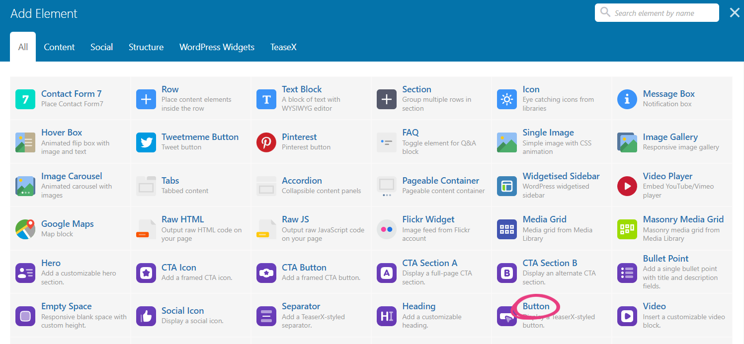
You can add a new button to the page by clicking the plus icon located at the top or within one of the existing sections.

When the Add Element window appears, locate and select the Button widget from the list.

Step 4
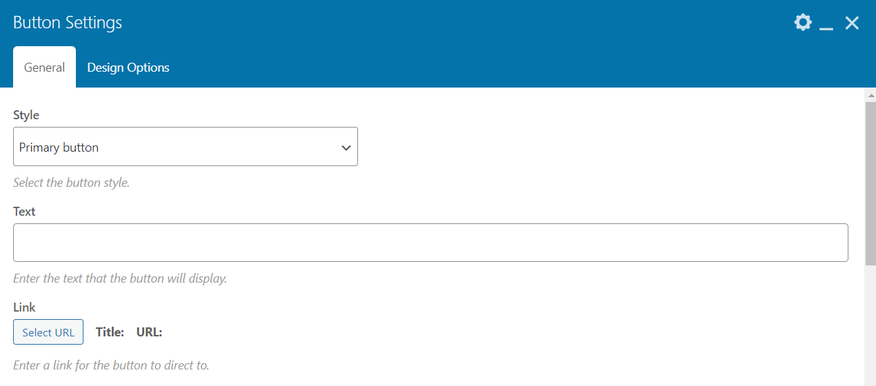
Selecting the widget will display a new window — Button Settings — which comes with four customization options.

All of them will be covered below.
Button Style
The first option — Style — lets you choose between two button styles: primary and secondary. The color and font properties of those styles can be customized through Theme Options.

You can find more information on the buttons’ color and font properties in the following guides:
- The Complete TeaseX Color Guide (Playful Pixie) — COMING SOON
- How To Change Fonts
Text
Next, enter the text you want to show over the button into the Text field.

Link
After that, click on the Select URL button to add the site or page to which the button will direct on click. This will display a new popup: Insert/edit link.

In the popup, enter the link into the URL field and skip the next field, Link Text.

If you want the link to open in a new browser tab, tick the Open link in a new tab check box. Otherwise, leave it unchecked.

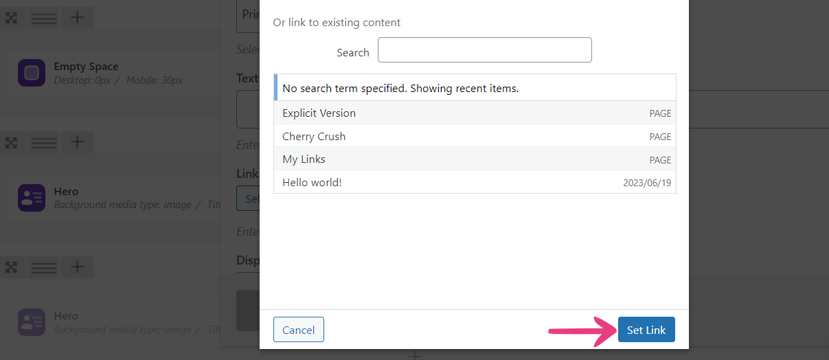
Click on the Set Link button in the bottom right corner to apply the link.

Display
The Display as option changes the button’s CSS display property. That is, it lets you choose whether the button will be an Inline or a Block element. Inline buttons can be placed in the same row, side by side, while block buttons will push all other elements into a new row.

Here’s a preview of the Block element option.

And here’s what a pair of buttons will look like with Inline element selected.

Step 5
After configuring your custom button, click on Save changes at the bottom to add it to the page as a widget.

Optional
You can change the button’s position by hovering your cursor over the widget, holding down the left mouse button over the move icon as depicted below, and dragging it to the desired location.

Step 6
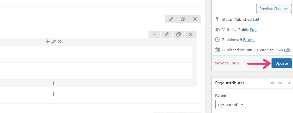
Once you’re finished adding buttons to the page, click on Update to apply the changes.

Your custom button(s) will be immediately visible on the site.


