How To Change Image Style & Behavior
The TeaseX and ModelX themes’ page builder lets you change an image’s style and add on-click behavior using the Single Image widget.
Keep reading to learn how to do it.
Step 1
Log into your site by entering its domain into the browser’s address bar followed by /login and hitting enter.

Note: You can find your admin credentials in one of the support tickets in the Vicetemple client area. If you’re not sure where to find them, feel free to send us a message over live chat.
On the Login page, enter your username or email into the Username or Email Address field, your password into the Password field, and click the Log In button.

The page will reload and direct you to the admin dashboard.
Step 2
Find and select Pages in the sidebar to the left.

Then, locate the page you want to update, and click on it to begin editing.

Step 3
Hover over the image you want to change, and click on the pencil icon to edit it when the options appear.

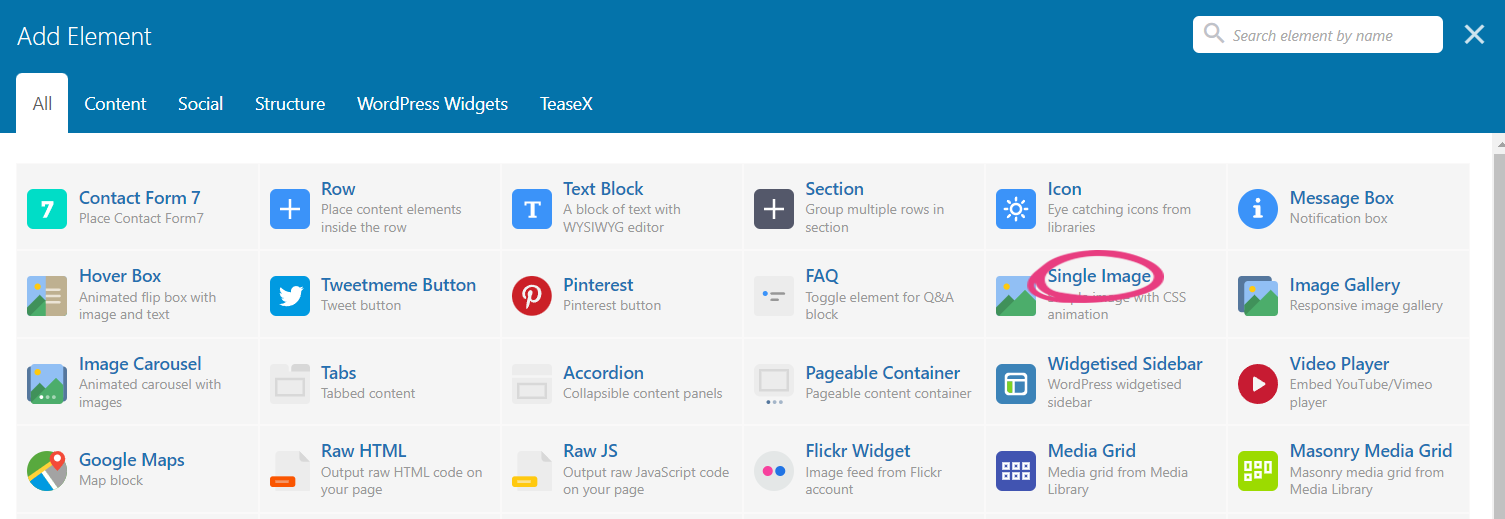
Alternatively, you can add a new image to the page by clicking the plus icon at the top or within one of the existing sections.

When the Add Element window appears, locate and select the Single Image widget from the list.
Both existing and new image widgets come with the same set of options, which are described below.
Step 4
The widget’s settings, as shown in the Single Image Settings window, consist of ten options. In this guide, we’ll fully cover the sixth and the seventh — Image style and On click action.
Image Style
The Image style option includes 17 style presets, each affecting your image differently.

The descriptions and previews for each style are covered below.
Default
The image is shown using its original properties. In other words, it’s left unchanged.

Rounded
The image will have rounded corners.

Note: This option bypasses the global Border radius option.
Border
The image will receive a border, which is often used to emphasize it by separating it from its surrounding elements.

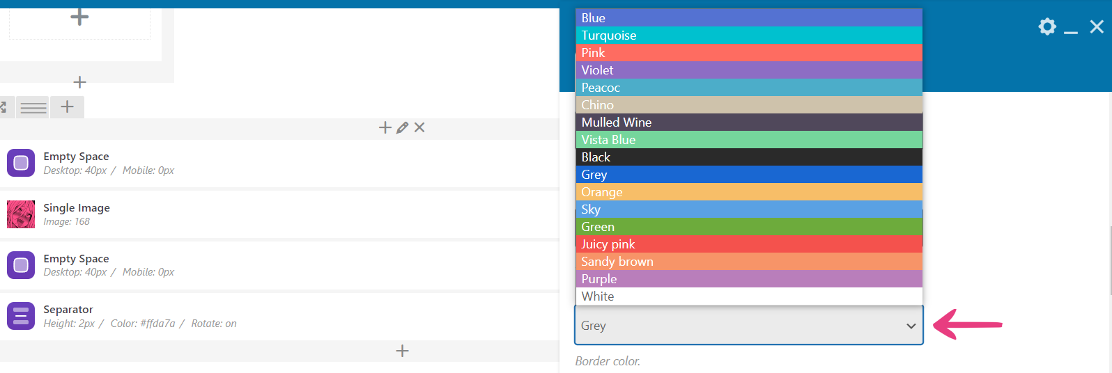
When you choose the Border style, a new option called Border color will appear below it. The new setting lets you change the border’s color using a predefined value from its drop-down menu.
Outline
The Outline style refers to an effect where an image’s edges are emphasized by two borders that are separated by a transparent space.

Selecting the Outline style will also give you the Border color option, allowing you to change the borders’ color using a predefined value.
Shadow
The image will be shown with a faint 10% shadow, helping you create a sense of depth.

Note: Due to the shadow’s dark color, it will only be visible on light backgrounds.
Bordered Shadow
The Bordered shadow style applies a shadow several pixels away from the image, creating a transparent border in-between.

Note: Like the previous style, Bordered shadow will be visible only on light backgrounds.
3D Shadow
The 3D Shadow style applies a shadow behind the bottom left and bottom right corners of the image, resulting in a three-dimensional effect and an increased sense of depth.

Round
Similar to the Rounded style, Round applies a higher degree of rounding to the image’s corners, which results in a circular shape if the image has identical width and height (square) or an elliptical shape if it has uneven width and height (rectangle).

Round Border
The Round Border style is a combination of Round and Border, giving your image a border and a circular, or an otherwise elliptical, shape.

Selecting the Round Border style will also give you the Border color option, which you can use to change the border’s color.
Round Outline
Similar to the previous style, Round Outline is a combination of two styles: Round and Outline, giving your image an outline and a circular, or an otherwise elliptical, shape.

Selecting the Round Outline style will also give you the Border color option, with the same purpose and functionality it offered for previous styles.
Round Shadow
Like the previous two styles, Round Shadow is a combination of two existing styles. It will apply both the rounding and a shadow effect to the image.

Round Border Shadow
This is another combination style, applying Round and Bordered Shadow simultaneously.

Circle
The Circle style rounds an image down to a circle shape.

Circle Border
Circle Border is a combined style that applies the Circle and Border styles to the image.

Like the previous border styles, selecting Circle Border enables the Border color option.
Circle Outline
Similar to other outline and combination styles, Circle Outline applies both the Circle and Outline styles to an image.

Selecting the Circle Outline style will also enable the Border color option.
Circle Shadow
Circle Shadow is a combined style that rounds the image down to a circle and applies a shadow effect for depth.

Circle Border Shadow
The Circle Border Shadow style applies the Circle and Bordered Shadow styles to an image. See Bordered Shadow for more information on this effect.

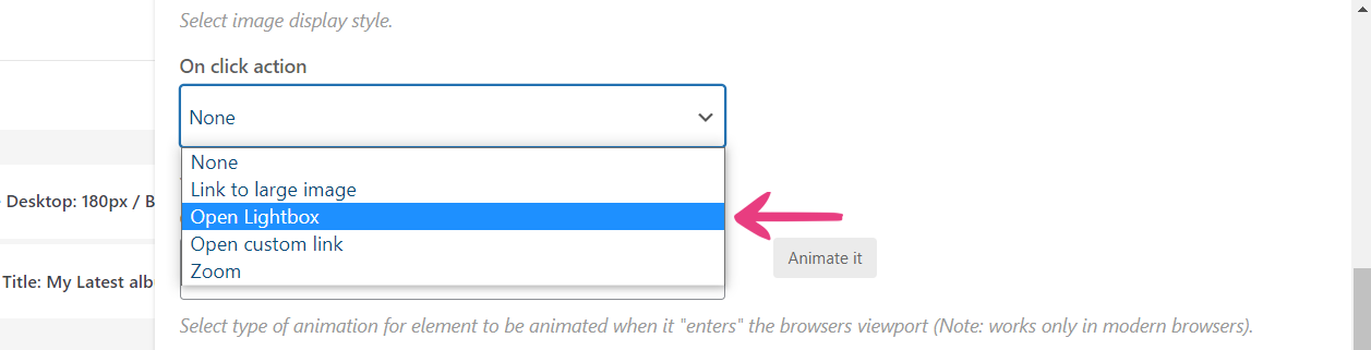
On-click Action
The next option — On click action — adds one of four available on-click behaviors to an image, as described below.
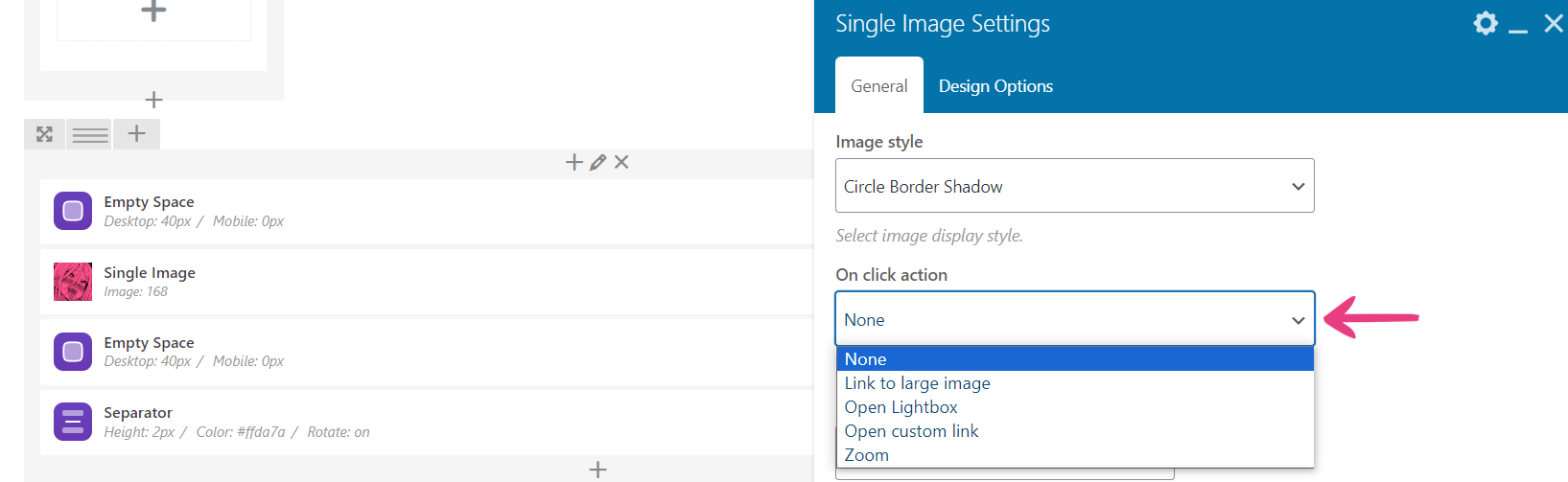
Note: Selecting None will apply no additional functionality to the image.
Link to Large Image
The Link to large image behavior lets your visitors view the image in its original size by clicking on it.

Once Link to large image is selected, a new option — Link Target — will appear below it, letting you choose whether the image will open in the same browser tab or a new one.

Open Lightbox
Lightbox is an image-previewing method that opens an image on the page instead of directing away.
A lightbox is a window overlay that appears over a page, dimming and disabling the rest of it. This method ensures that your visitors cannot interact with other elements on the page until they take action — in this case, by exiting the lightbox.

To enable this behavior for the image, select Open Lightbox from the On click action drop-down.
Open Custom Link
The images you add to your pages can also direct to other pages on your or any other website. Select the Open custom link option to add a link to your image.

Once it is selected, a new option — Image Link — will become available, where you can enter the URL to which you want the image to direct on click.

Zoom
The last option in the On click action drop-down menu is Zoom, which allows your visitors to click on the image and zoom in with another click.

CSS Animation
CSS animations let you add dynamic effects to your site’s elements — in this case, images. For more information on how to apply animations to your image, locate the CSS Animation option and follow this guide.

Step 5
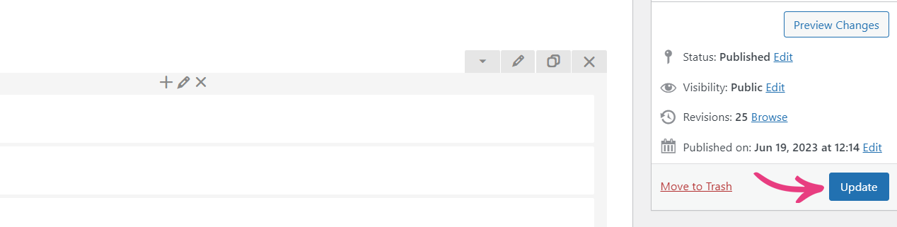
Once you’ve added a new style or on-click behavior, click the Save changes button to apply it.

Finally, click on the Update button to make your changes go live.