The Complete TeaseX Wicked Witch Color Guide
The TeaseX Wicked Witch theme’s 20+ built-in color options let you recolor any element on your website, such as the background, text, separators, links, icons, and buttons (including their hover and active states).
Continue reading to learn how to use those options.
Step 1
Log into your site by entering its domain into the browser’s address bar followed by /login and hitting enter.

Note: You can find your admin credentials in one of the support tickets in the Vicetemple client area. If you’re not sure where to find them, feel free to send us a message over live chat.
On the Login page, enter your username or email into the Username or Email Address field, your password into the Password field, and click the Log In button.

The page will reload and direct you to the admin dashboard.
Step 2
Click on Theme Options in the admin bar at the top.

Then, find and select the Colors tab, which consists of 15 global color options and one to customize the buttons further.

Step 3
The color options are separated into five groups: Main, Decorations, Links & Icons, Menu, Input, and Button, each affecting a specific set of elements, as explained further below.
How to Change Colors
Before we continue with the options, we’ll quickly go over how you can use them.
Each color option described in this guide lets you change the colors using one of the following methods: pasting the color’s code or selecting it from the color picker.
To use the first method, paste a color’s hex, RGB, or RGBA code into the desired option’s field.

The second method lets you select the color directly from the color picker. Click the colored rectangle on the right, and pick a hue from the color picker when it appears.

Once you’ve pasted or selected your desired color, you can use the slider at the bottom to change the color’s opacity. The lower the value, the more transparent the elements will be.

To reset the color back to the TeaseX demo’s default color, click the eraser icon within the input field.

Now that you know how to change the color, keep reading to learn which elements are affected by each option.
Main
The Main section consists of two color options: Primary color and Secondary color.
Primary color
The first option — Primary color — lets you customize the color of all text elements on the website.

Here’s an example of the primary color change.
Note: Some of the theme’s elements have the ability to overwrite the default text color. Those elements include the page builder’s Text Block widget, the Age Verification page, and the Links page. You can read more about these options in their respective guides.
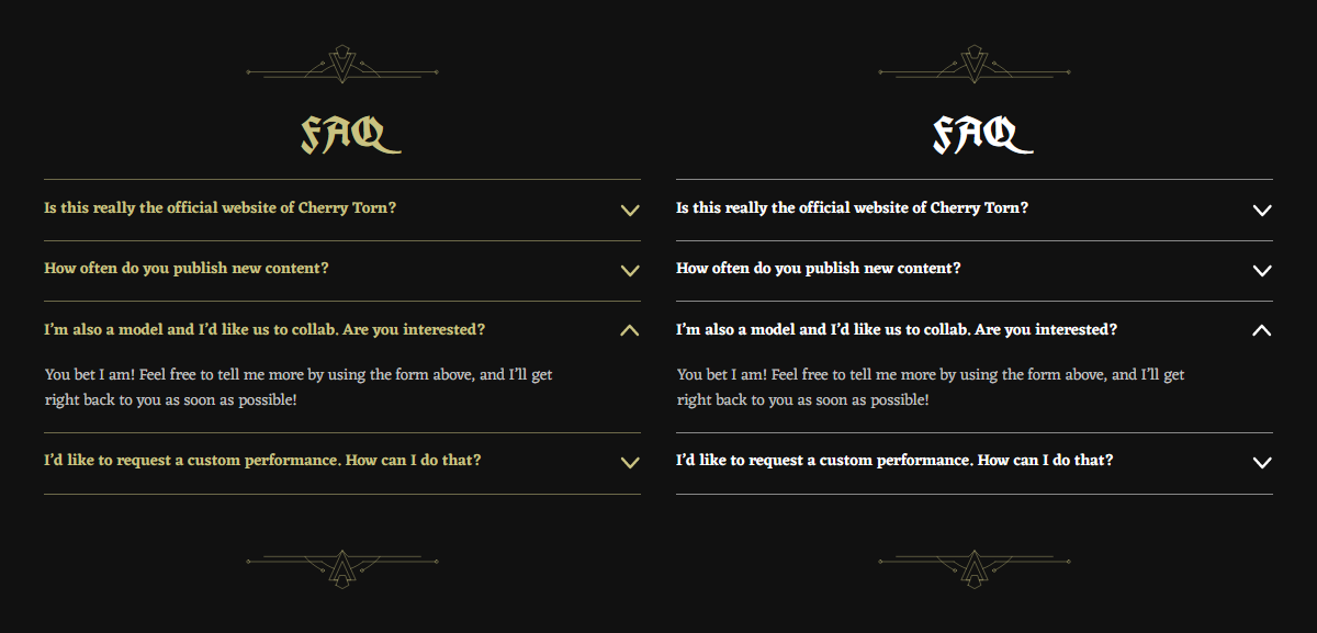
Secondary color
The second option — Secondary color — lets you recolor the navbar’s separator and the FAQ section’s answers.

Here’s an example of the secondary color change.

Decorations
The Decorations section consists of only one option — Decoration color.

This option affects the following widgets’ decorative elements: Hero, CTA, and Advanced CTA.

Links & Icons
The Links & Icons section consists of three color options: Link color, Link color (hover), and Icon color.
Link color & Link color (hover)
The first option — Link color — lets you change the color of all links on the website, while the second one — Link color (hover) — sets their color on mouseover.

Here’s an example of a link with its colors changed.

Icon color
The last option — Icon color — changes the Flat icon set’s color in the navbar and the footer.
Here are the navbar icons.
And here are the footer icons.
Note: The Original icon set cannot be recolored, as the icons use their source website’s original logo design and colors.
Menu
The Menu section has two options: Link color and Link color (hover). Their purpose is identical to the previous section’s options with the same name. However, they affect only the main menu’s links located in the navbar.

Here’s what the main menu looks like when there are available links.

Input
The Input section has only two options that affect the default and mouseover border color of all input fields on the website. Those options are Border color and Border color (hover).

Here’s an example of what the input fields look like.

Button
The Button section comes with two sets of options: Background and Other. Each option set will be described below.
Background
The first option set — Background — consists of three options (Default, Hover, and Active) that let you set the buttons’ default, hover, and active colors.

The default button color is shown immediately, the hover color on mouseover, and the active color on mouse-click.
Here’s what a button’s color states look like by default, on mouseover, and when clicked.
Other
Like the previous set, Other also has three options — Text color, Shadow color, and Border radius — each affecting a different property of the buttons.

The first option — Text color — lets you change the button’s text color, as depicted further below.
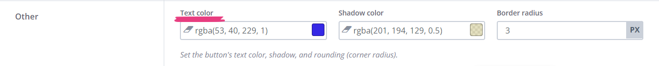
The second option — Shadow color — lets you change the color at the button’s top rim.

Tip: The shadow option helps create a 2.5D effect for the button. We recommend using a color similar to the text color with its opacity reduced to half to complete the look.
The third and final option — Border radius — changes the button’s border radius (corner rounding). The higher the value, the more rounded the button will be.

Here are button examples with different text colors and corner rounding.

Step 4
In addition to the Colors tab’s options, another eight color options are available on the Theme Options page, scattered across its remaining tabs. Each of them will be described below.
Background Color
To change the website’s background color, select the General tab and find the Background color option. You can set a new background color by following the instructions under Step 3.

Navbar Color
The navbar has three special-case background color options: Sticky navbar color, Sticky navbar blur, and Menu color (mobile). You can find these options on the Header tab.

The first two options — Sticky navbar color and Sticky navbar blur — are available only if the Sticky navbar option is enabled.

For more information on the sticky navbar and how to customize it, check this guide.
The third option — Menu color (mobile) — lets you change the mobile navbar and mobile menu’s color.

Here’s what the mobile navbar looks like.

And here’s what the mobile menu looks like when expanded.

Note: This option will apply only to the expanded mobile menu and not the mobile navbar if the Sticky navbar option is enabled.
Footer Color
In addition to changing the navbar’s background color, you can also change the background color of the footer displayed at the bottom of your website. Select the Footer tab and find the Footer color option to do so.

Here’s what the footer looks like.

Age Verification Gate
You can change the age verification gate’s background color from the Age Verification tab. However, the color won’t be visible if the page features a background image.
For information on how to customize the age verification gate, check this guide.
Link Page
In addition to changing the links’ colors across the website, the Link page comes with a set of options to customize only the links on that specific page. Check this guide for information on how to customize the link page.
Step 5
After you’ve configured the desired colors for your website, click the Save Changes button at the top to apply the changes.


