How To Enable and Customize The Main Menu
The TeaseX theme lets you customize every part of your website. That includes the main menu — a navigation menu often referred to as a navbar, typically located at the top of every web page.
Keep reading to learn how to do it.
Step 1
Log into your site by entering its domain into the browser’s address bar followed by /login and hitting enter.

Note: You can find your admin credentials in one of the support tickets in the Vicetemple client area. If you’re not sure where to find them, feel free to send us a message over live chat.
On the Login page, enter your username or email into the Username or Email Address field, your password into the Password field, and click the Log In button.

The page will reload and direct you to the admin dashboard.
Step 2
There, locate the Theme Options link at the top, and click on it.

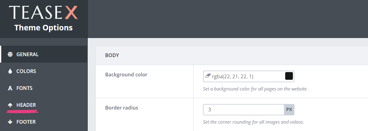
You will find yourself on the Theme Options page, where you should select the Header tab.

Step 3
The Main group has two options relevant to the menu’s functionality. The first is available immediately, and the second one is shown only if the menu is enabled.
We’ll explain each one below.
Enable the Menu
Locate the Enable menu option and toggle the switch. Doing so will display a check mark.

Note: The menu will not be shown until you add at least one link to it.
Add Links
Once the menu is enabled, a subsection called Links will become available underneath. By using it, you can add up to five links to the main menu.
To do so, click the Add link button, which will create a new link widget.

You can give the link widget a name (1), duplicate (2), or delete it (3).

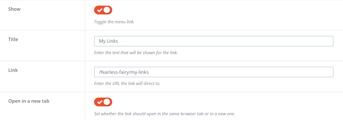
Once you select a link widget, the following options will become available:
- Show, to display the link on the site
- Title, to set the link’s text
- Link, to add a URL to the link
- Open in a new tab, to set whether the link will open in the same browser tab or in a new one

Customization
In addition to enabling the menu and adding links to it, you can customize it by setting different fonts and colors.
Menu Color (Mobile)
As the name suggests, the Menu color (mobile) option lets you change the menu’s color only on mobile devices, and it won’t affect its appearance on desktops. You can set the color by either pasting the color’s code or selecting it from the color picker.
To use the first method, paste a color’s hex, RGB, or RGBA code into the field.

The second method lets you select the color directly from the color picker. Click the colored rectangle at the right end of the field, and pick a hue from the color picker when it appears.

Here’s what the mobile menu using the new color from our example will look like:

Link Colors
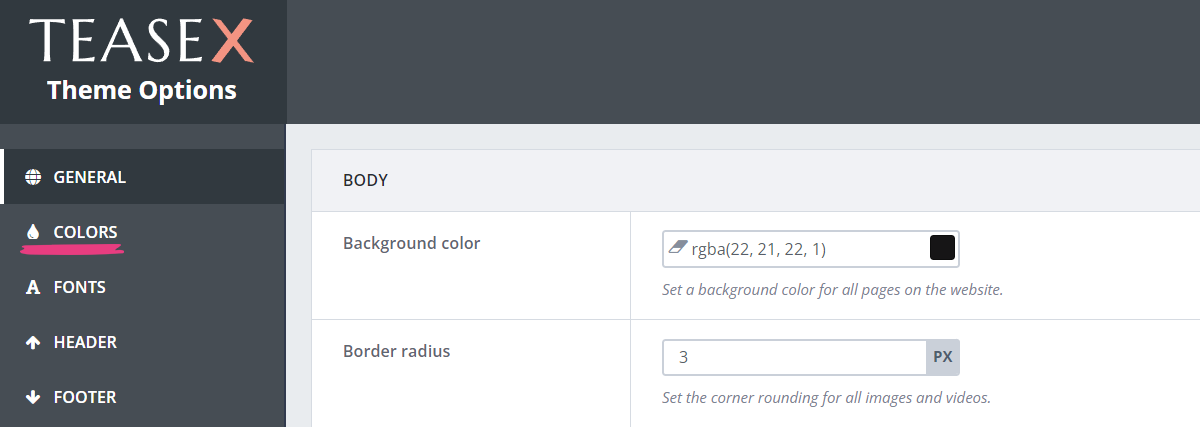
To customize the links’ colors in your main menu, head over to the Colors tab. You can do so by selecting Colors from the Theme Options menu.

There, locate the Menu section containing two options:
- Link color, which sets the links’ default color
- Link color (hover), which changes the links’ color on mouseover

You can set new colors for each of these options via one of the following methods: pasting the color’s code or selecting it from the color picker.
To use the first method, paste a color’s hex, RGB, or RGBA code into the field.

The second method lets you select the color directly from the color picker. Click the colored rectangle at the right end of the field, and pick a hue from the color picker when it appears.

Fonts
You can change the links’ font properties, such as the font family, font size, and font weight on the Fonts tab. For more information on these properties and how to change them, check our guide on changing fonts.
Step 4
After you’re done customizing your main menu, click the Save Changes button at the top to apply all your changes.

Your new main menu will be immediately visible on the site. If the social icons are enabled, it will be in the center:

If the social icons aren’t enabled, the main menu will be on the right:

If you wish to get more out of your header, take a look at our other guides:


